FREE authentication and FREE shipping included


Help me pick my Logo !
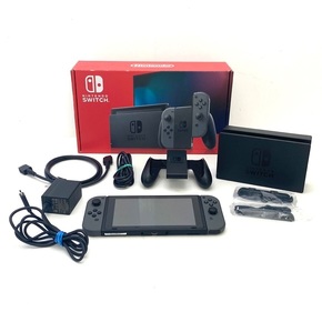
Boutique
$99,999 $99,999
Free
Shipping
Buy now, pay later
with ![]() .
Learn More
.
.
Learn More
.
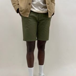
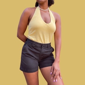
Size
Like and save for later
Add To Bundle
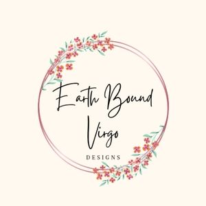
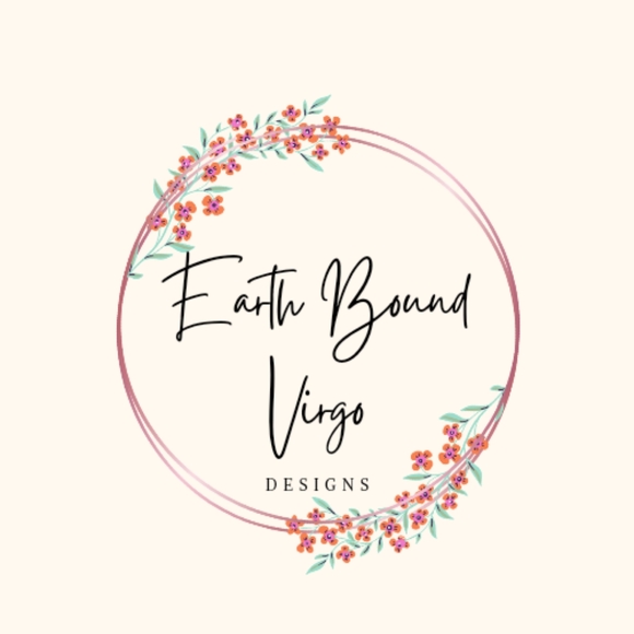
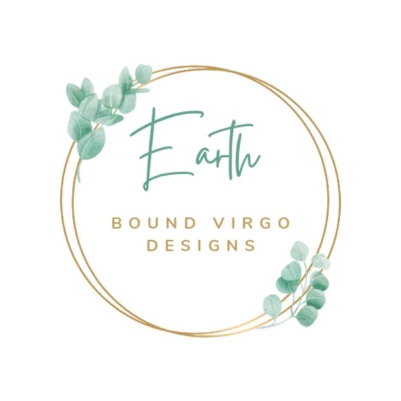
help me pick my page logo !
I've been wanting to update my user name and logo for awhile and have finally gotten around to designing logos for myself ! 🥰
comment 1 , 2 , 3 , 4 for your choice.
I love them all, I'm having such a hard time choosing .
Shipping/Discount
Posh Protect: Buyer Protection Policy
Get your order as described or receive your money back. Learn More.


mycitylimit
and
7 others
like this
11 Comments

abstract_sherri
I love the 1st and 3rd one the best but probably the 1st one a little more as it's clean and to the point. beautiful job on em all though!
Jun 06Reply

smadden424
Ooh, these are all so pretty! Hard to choose, but I have to go with #1!🥰
Jun 06Reply

lonedog_tiedyes
I have to agree they’re all so pretty but #1 is my favorite too 🫶🏼
Jun 06Reply

pdufault120
Definitely #2
Jun 06Reply
pdufault120
....it pops more.
Jun 06Reply

imemineyours61
I like #4 with the focus on Earth. #1 is great as well.
Jun 06Reply

laurievjewelry
I love #3
Jun 07Reply

whimsical_cache
#4 gives off good vibes! Fave 🤗
Jun 07Reply

sassykw
#1 is my favorite
Jun 07Reply
imemineyours61
I love it❤️❤️❤️❤️❤️
Jun 10Reply
pixielife
🤎🌿This is fun. I think Put #1 Inside #3 and Add Some Color. I like flowers. I hope you are well. Love your work and I get to See it hanging in my house every day. 🌿🤎🌸🌻💐🪻🌺🌼🌿
Jan 11Reply


Find Similar Listings
About the seller

@earthboundvirgo
Last Active: Oct 11 2023
Fowlerton, IN
468
Listings100+
Sold Listings1 day
Avg. Ship time34
Love NotesAbout the seller
@earthboundvirgo
Last Active: Oct 11 2023
Fowlerton, IN
